The neon glow of a Tokyo convenience store used to be a reliable psychedelic experience. You walk through those sliding glass doors and the world hits you in high-definition saturated reds, electric blues, and that specific, aggressive shade of yellow that can only belong to a bag of potato chips. It is a sensory contract. You trade a few hundred yen for a burst of dopamine packaged in a rainbow.
But lately, the rainbow is leaking.
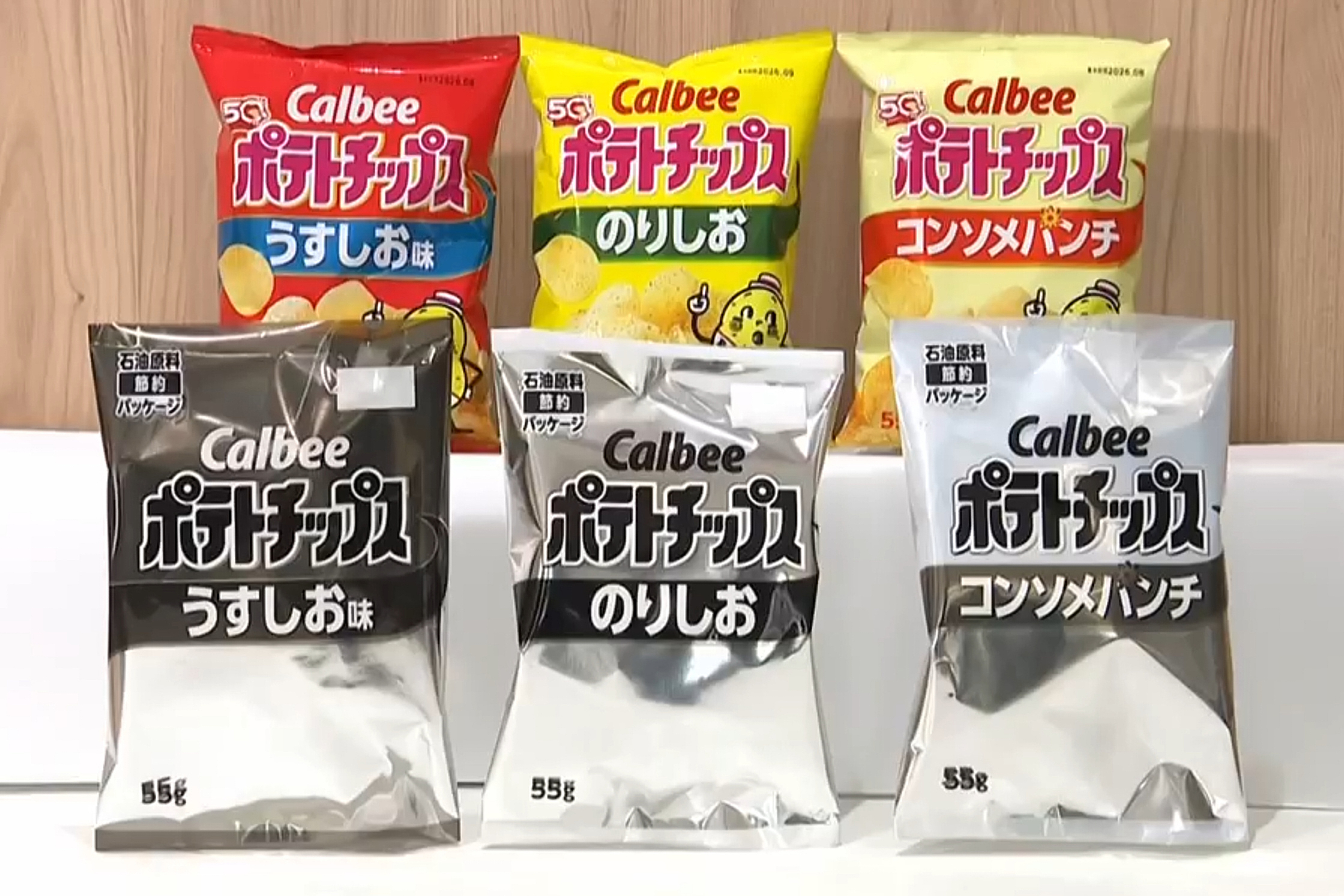
Walk down the snack aisle today and you might feel like your vision is failing, or perhaps you’ve stepped into a noir film. The bags are still there. The familiar crunch remains inside. But the vibrant inks have retreated, replaced by a stark, utilitarian grayscale. This isn't a bold new branding exercise by a minimalist design firm. It is the visual symptom of a supply chain hemorrhaging under the weight of a distant, brutal conflict.
As the war in Iran intensifies, the ripples have traveled thousands of miles to reach the plastic film of a snack package in Osaka. The world is discovering, in the most mundane way possible, that our colorful modern life is surprisingly fragile.
The Pigment Pipeline
To understand why a snack bag loses its luster, you have to look at the chemistry of the shadows. Industrial printing ink isn't just "paint." It is a complex cocktail of resins, solvents, and pigments, many of which rely on petroleum derivatives and specific chemical precursors that are heavily concentrated in the Middle East.
When geopolitical tensions in the Persian Gulf shifted from diplomatic posturing to active, prolonged kinetic warfare, the global flow of these components didn't just slow down; it curdled. Iran is a critical node in the production of the raw materials that allow a printing press to produce "Sunset Orange" or "Electric Lime." With refineries shuttered or redirected toward the war effort, and shipping lanes through the Strait of Hormuz turned into a gauntlet of risk, the ink industry found itself staring at empty vats.
Consider a small-scale snack producer in Saitama. Let’s call the owner Kenji. For twenty years, Kenji has sold spicy seaweed crisps in a bag so red it practically vibrates. It’s how his customers find him in a crowded aisle. Last month, his supplier delivered a manifesto instead of a shipment. The cost of cyan and magenta pigments had tripled. The availability of the specialized binding resins—derived from Iranian light crude byproducts—had dropped to near zero.
Kenji had two choices: raise the price of a bag of chips to the cost of a luxury lunch, or strip the color away.
The Psychology of the Monochromatic Meal
We don’t just eat with our mouths. We eat with our expectations.
Psychologists have long understood that the color of packaging dictates our perception of flavor. Red suggests heat or sweetness; blue suggests salt or coolness. When you remove that color, you break the psychological link between the consumer and the product.
In a hypothetical grocery store in suburban Kyoto, a shopper reaches for what used to be a bright purple bag of onion rings. Now, it is a ghostly white pouch with black lettering. The brand is the same. The ingredients are identical. But there is a hesitation. The "graying" of the shelf creates a sense of mourning. It is a constant, nagging reminder that the world is out of sync.
This isn't just about aesthetics. It’s about the erosion of the "normal." When the high-level abstractions of war—geopolitics, trade embargoes, and energy security—manifest as a colorless bag of crackers, the conflict becomes intimate. You can ignore a headline about a refinery fire in Abadan. You cannot ignore the fact that your favorite afternoon treat looks like it was printed on a 1980s photocopier.
The Invisible Stakes of a Drying Well
The ink shortage is a "canary in the coal mine" for a much larger industrial rot. While the snack industry is the most visible victim because of its high-volume turnover, the implications are much deeper.
- Pharmaceutical Labeling: If the ink supply continues to dwindle, the risk moves from the snack aisle to the medicine cabinet. High-contrast, color-coded labeling on medication is a safety standard. If pharmacists are forced to rely on monochrome labels that look nearly identical, the margin for human error widens.
- The Logistics of Identification: Global shipping relies on color-coded barcoding and hazardous material warnings. A world without vibrant, durable ink is a world where logistical friction increases, slowing down everything from food delivery to emergency supplies.
- The Economic Ripple: Japanese printing firms are among the most advanced in the world. They are currently pivoting to soy-based inks and alternative pigments, but these "green" solutions often require different drying temperatures and slower press speeds. This means less efficiency, higher energy consumption, and a smaller bottom line.
The war in Iran has exposed a terminal dependency. We have built a global aesthetic on the assumption that the ingredients for color would always be cheap and plentiful. We treated the "look" of our world as a given, rather than a privilege maintained by a delicate balance of peace.
The Great Fade
The transition to black-and-white isn't happening all at once. It’s a slow fade. First, the metallic foils disappeared. Then, the multi-tonal gradients were replaced by flat blocks of color. Finally, the colors themselves began to vanish, leaving behind the skeletal remains of brand logos.
There is a strange, accidental honesty in these new packages. Without the distracting luster of professional marketing, the product is laid bare. You see the plastic for what it is. You see the food for what it is. It is a forced austerity that no one asked for but everyone must now navigate.
Companies are trying to frame this as an environmental win. They use words like "minimalism" and "eco-friendly" to mask the fact that they simply cannot find the chemicals to make the red ink stick to the bag. But the Japanese consumer is savvy. They know that a lack of color isn't a design choice; it’s a casualty report.
The Ghostly Future
How long can a society sustain its spirit when the world literally loses its color?
In the short term, we adapt. We learn to read the text more closely. We look for the shape of the bag rather than the hue of the plastic. But there is a cumulative weight to living in a grayscale reality. Color is a language of vitality. It is a signifier of abundance. When the colors go out, it feels as though the lights are being dimmed on the global stage.
The ink will return eventually, of course. Wars end. Supply lines are rerouted. Synthetic alternatives are perfected in labs far from the front lines. But the memory of the "Gray Years" will persist. It will serve as a reminder that a spark in the Middle East can dim the brightness of a shelf in Tokyo.
Last week, a major confectionery brand released its flagship chocolate bar in a plain white wrapper with a single, thin black line of text. No logos. No gold foil. No "New and Improved" starbursts.
It sat there on the shelf, a stark, pale rectangle among the few remaining colorful competitors. A young girl reached for it, then stopped. She looked at the white wrapper, then at her mother, her face clouded with a confusion she didn't have the vocabulary to express. She didn't know about the tankers in the Gulf or the chemical shortages in the refineries. She only knew that the world looked a little more tired than it did yesterday.
The mother took the girl’s hand and moved her along, leaving the ghost-white chocolate bar behind. On the shelf, the snack stood like a tiny, plastic tombstone for a world that used to be in color.