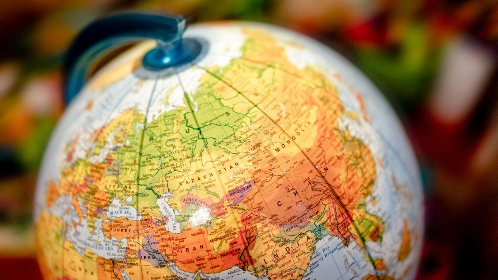
You think you know how big countries are. You do not.
Look at a standard world map on your wall, in your school textbook, or pulling up on your phone. You see Greenland looking roughly the size of the entire continent of Africa. You see Alaska appearing massive, almost dominating the United States.
It is all an illusion.
Mathematics makes it impossible to flatten a 3D sphere onto a 2D piece of paper without stretching something. Cartographers have wrestled with this headache for centuries. The standard map you grew up looking at relies on the Mercator projection, a 1569 creation designed for sixteenth-century sailors who cared more about keeping a straight compass heading than getting landmass proportions right.
Because of that design choice, landmasses near the poles get dragged out and bloated. Meanwhile, regions sitting comfortably near the equator get compressed.
The Africa Sizing Reality Check
Let us look at actual numbers instead of flat-map geometry. On a traditional Mercator map, Greenland and Africa look suspiciously similar in area.
In reality, Africa is about fourteen times larger than Greenland. You could fit the entire United States, China, India, Japan, and large chunks of Europe inside the African continent with room left over.
Russia looks like an absolute monster on standard maps, dwarfing almost everything else. While Russia is undeniably huge, the Mercator projection bloats its northern expanse so severely that it swallows up its actual visual scale relative to equatorial regions.
This visual distortion goes deeper than paper geography. Human psychology naturally links physical size to global importance. When generations grow up looking at a map where northern nations dominate the visual real estate while the global south shrinks, it quietly shapes how we perceive geopolitical power, resources, and relevance.
Why Every Map Projection Fails Somewhere
You cannot win the flattening game. Every single flat map tells a lie because of geometric limits proved out by mathematicians like Carl Friedrich Gauss.
- The Mercator: Perfect for navigation and straight-line plotting, terrible for relative size as you move away from the equator.
- The Gall-Peters: Keeps areas proportional, but stretches shapes out vertically until continents look like melting wax.
- The Robinson or Winkel Tripel: Compromise maps that bend the truth a little bit everywhere so that nothing looks completely absurd, which is why organizations like National Geographic lean toward them.
- The Equal Earth: Introduced to fix the glaring visual bias against tropical and equatorial developing nations by preserving accurate sizing.
Governments and international bodies are starting to act on these distortions. Activist efforts like the "Correct The Map" campaign, backed heavily by the African Union, have pushed international institutions to move away from relying on maps that minimize equatorial landmasses. Countries like France have announced shifts away from the Mercator standard for official geographic depictions, recognizing that the maps we choose to display carry cultural weight.
How to Check Real Proportions Yourself
Stop trusting flat rectangles. If you want to see how geography actually fits together, pull up an interactive digital globe tool like Google Earth or visit resources like TheTrueSize.com, where you can drag countries around and watch them shrink or expand dynamically as they move north or south.
Next time you look at a flat world map, remember you are staring at a stretched-out compromise built for sailors who died five hundred years ago. Keep a globe handy, or at least remember that your screen is lying to you.


-copy.jpeg?width=1200&auto=webp&trim=17%2C192%2C547%2C1)